Platform update: New look. More power.
Hey guys,
We have some exciting news for you! Today, we launched a bunch of new features on our platform that we are super excited to share with you.
For simplicity, we’ve broken down these new feature releases into 3 buckets, and will provide a brief overview along with some visuals for you to learn more about them down below. 👇
The buckets:
- Platform Navigation
- Campaign Centric navigation
- Search & Payments
Platform Navigation
Let’s get started with platform navigation. Candidly, we will be the first to admit it, the old Jumbleberry platform UI/UX wasn’t the prettiest or optimal experience. It’s our goal to build a platform that is simple, intuitive & fun to use. We thought deeply about how our customers are currently using our features and the way they should be grouped & positioned to ensure we provide the best customer experience for advertisers & affiliates.
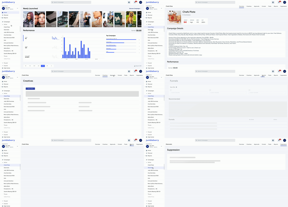
As you can see here, we’ve made quite a few aesthetic and usability changes that we are excited for you to begin using.
The Old:


The New:


Campaign-centric navigation
Okay, so we look a little nicer now and have made it much simpler for you to navigate around the features you require day-to-day - hopefully we can all agree on that. 🤝 But, an important part of this release was drawing clear lines between global features vs. campaign-specific features, and user accounts vs. organization accounts. So, we added a campaign-specific navigation menu that gives you more prescriptive direction on how and when to use our features. What does this mean? It means, a lot less clicking around to achieve your desired action. 🎉 Furthermore, separating users from organization workspaces is a first step toward our next big release of multi-user organizations. We’re excited to bring you new organization capabilities & permissions very soon. Stay tuned for that.

Search & Payments
And Finally, drumroll please… okay, so we may be exaggerating the build-up of this section just a bit, but we’ve made some necessary improvements to our search bar and relocated the payments feature. These two highly used features have been pulled out into the header, making them much more accessible to ensure they are at your fingertips when you need them.

As mentioned, all of these features are now LIVE on the platform for you to use! We encourage you to go and check them out and let us know what you think.
Thank you again for your continued support. We appreciate it.

Comments